BRAND IDENTITY FOR THE ANDALUSIAN BIOTECH FOUNDATION
CREATIVE DIRECTION
This design was inspired by concepts inherent to the genome, such as print, combination or modularity. We aimed to emphasize the idea that the genome encodes life, therefore, we focused on giving importance to the interactions of the different graphics involved in the brand’s visual language; giving it a fractal feel.
CONCEPTUAL DESIGN
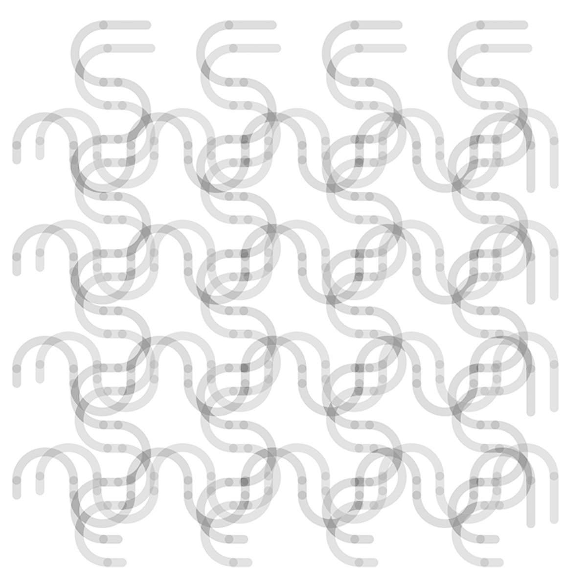
Keeping all of the above-mentioned in mind, we created an infinity pattern that depicts a dynamic abstraction of the combination of gene segments, which could easily adapt to any medium, format and color, meeting a wide range of marketing needs.
ISOTYPE DESIGN
This infinity pattern gave birth to a symbol that conveys a microscope look feel but also resembles a fingerprint or even a mandala. Such a symbol could be used either on its own, on top of the pattern, or as part of the brand’s combination mark.


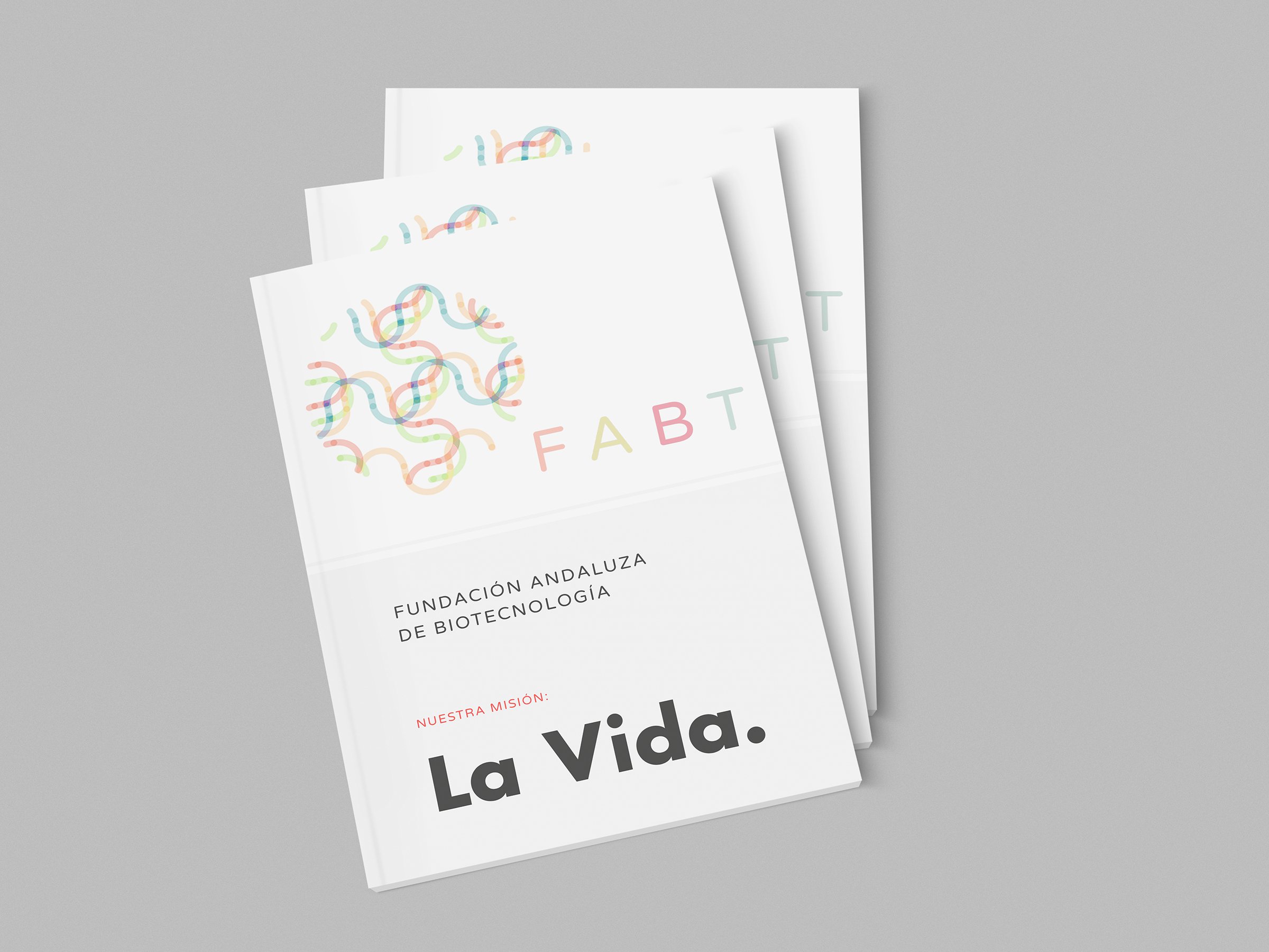
LOGOTYPE DESIGN
A suitable typeface and colour palette, in line with the educational forward-thinking values of the brand.
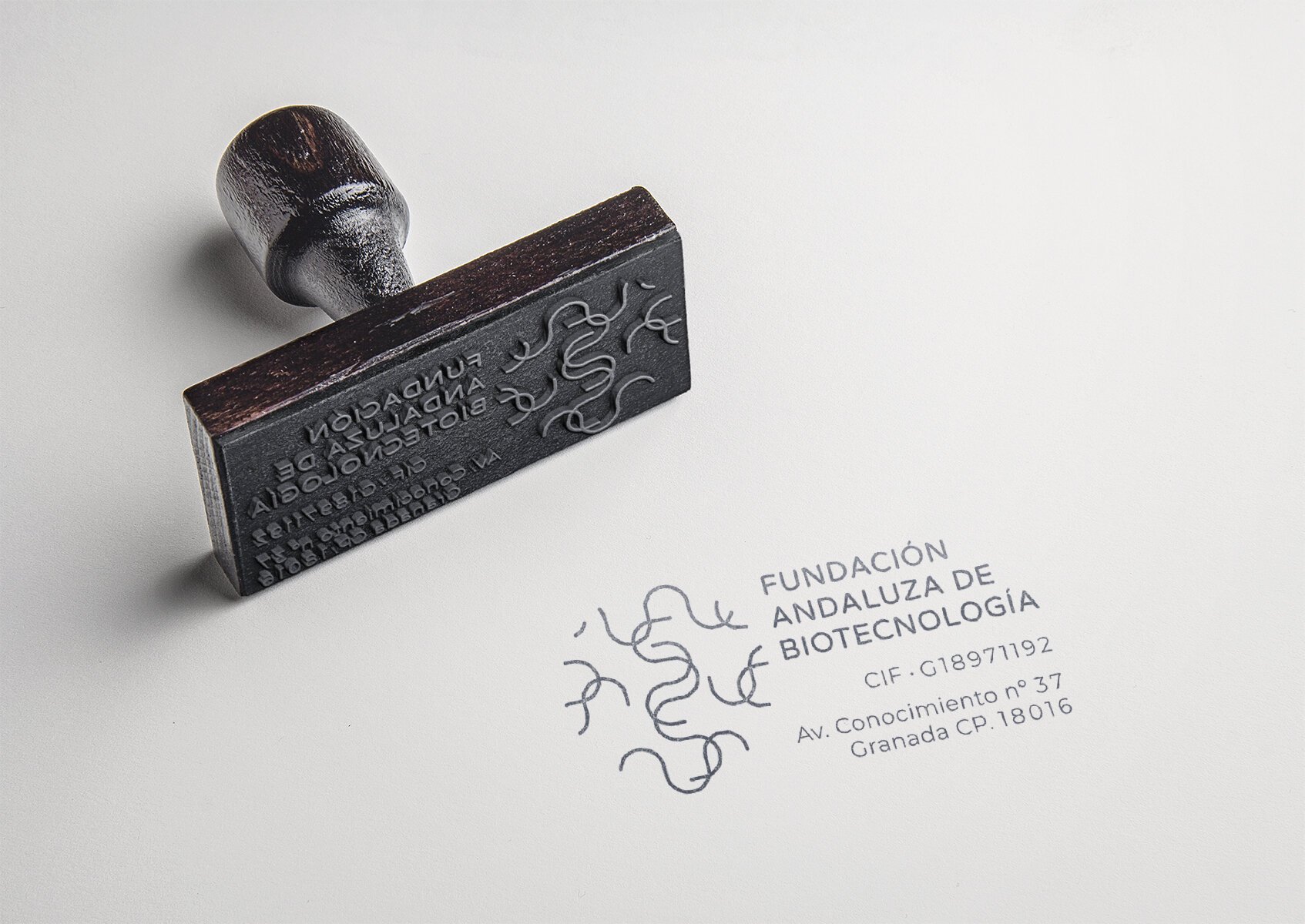
ISOTYPE SIMPLIFICATION
The isotype was distilled to the essence in order to produce a mark best displayed on solid media (e.g. 3D prints, laser cuts, stamps, etc.)